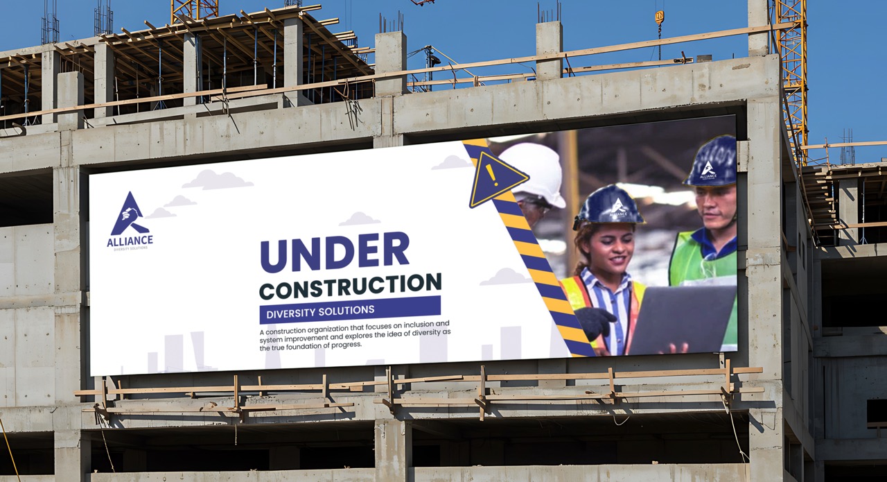
Alliance: Diversity Solutions, Logo and Brand
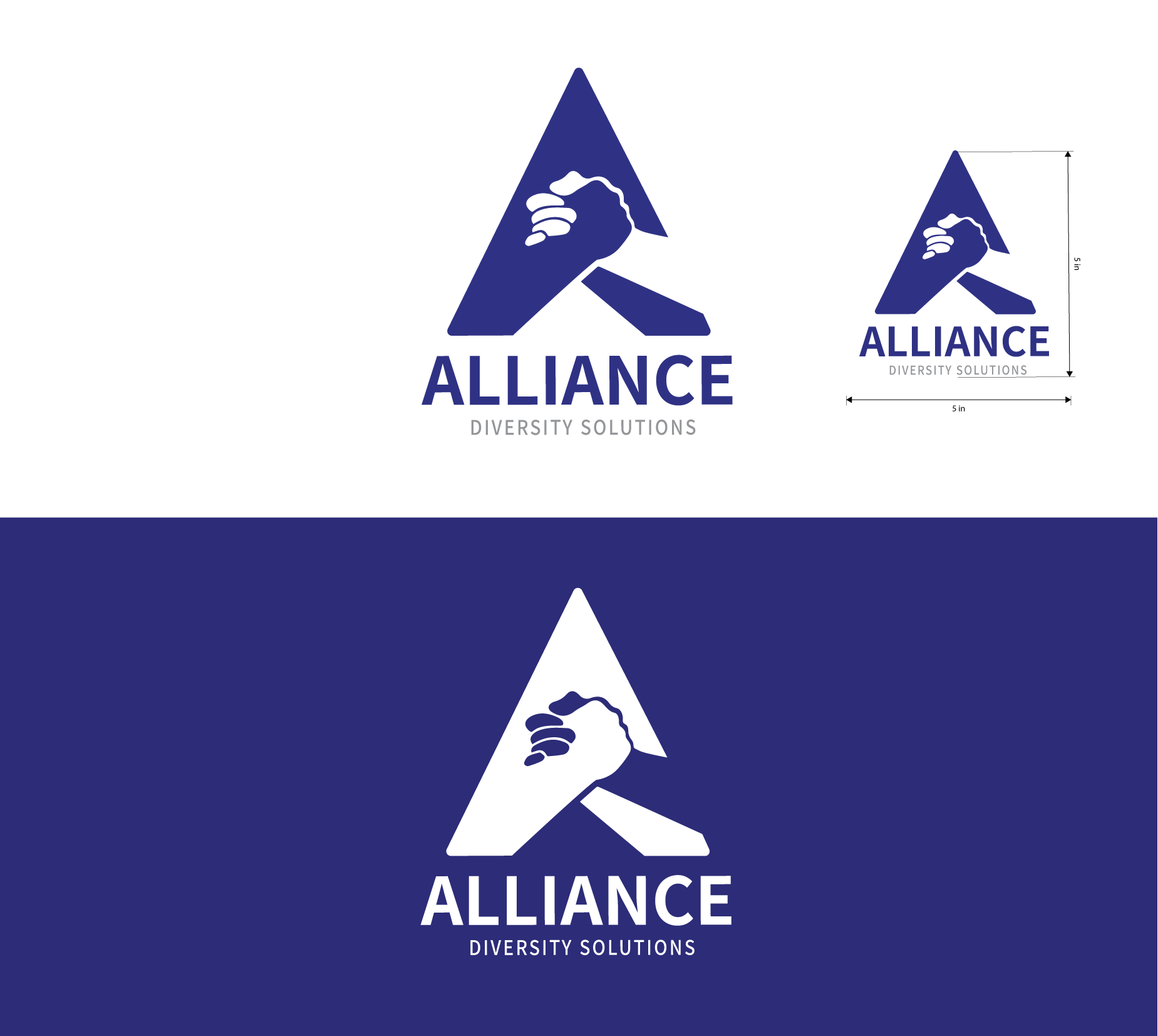
The Alliance: Diversity Solutions logo represents a construction organization that focuses on inclusion and system improvement and explores the idea of diversity as the true foundation of progress. Blue in this design represents trust, stability, and professionalism, while silver conveys modernity and innovation.

The primary mark features a stable and aspiring triangle shape that resembles the letter “A” to reinforce the company's name while also symbolizing unity and balance with the linked hands.
DESIGN PROCESS
The objective of this project was to develop a logo and brand identity for “Alliance: Diversity Solutions,” a conceptual construction company centered on inclusion and diversity. I began by sketching a range of logo directions, exploring different logo types including wordmarks (text-based logos), brandmarks (symbol-based icons), and combination marks, which integrate both text and symbol. The design process started in black and white to ensure the logo maintained clarity, versatility, and a strong visual impact before introducing color.
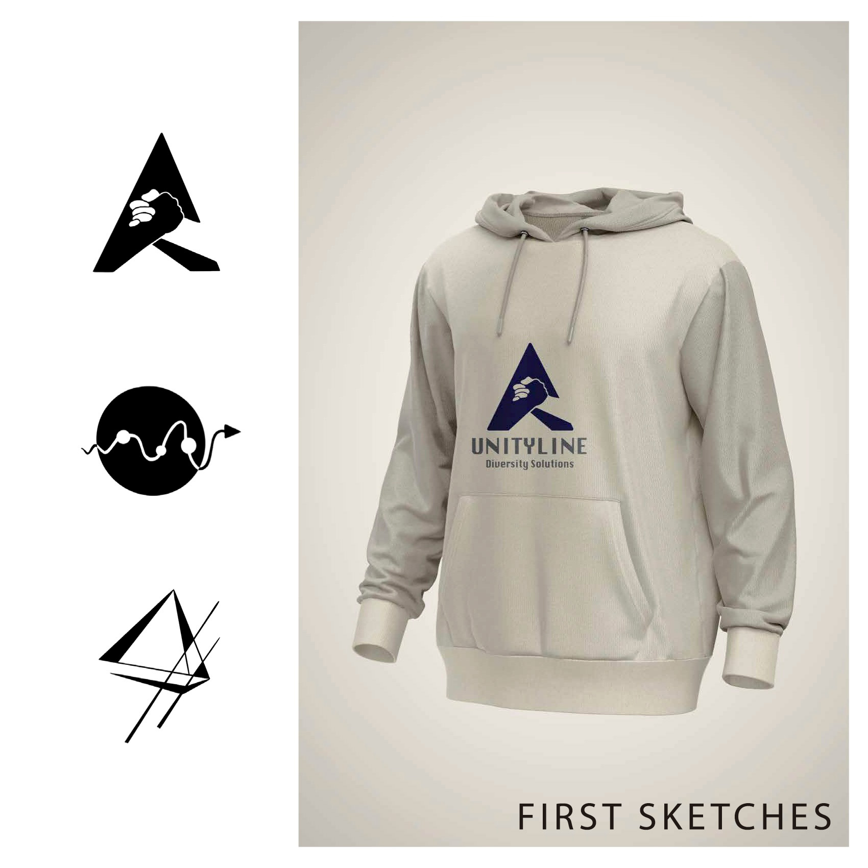
Through refinement and iteration, the final outcome became a combination mark that merges the company’s name with a symbolic element. The design incorporates the letter “A” into a triangular form, referencing reinforcing the company's name, while two hands connect within the shape using negative space, symbolize unity, balance and collaboration. I used a color palette of blue, gray and white, where blue communicates trust, and silver and white add a modern sense of innovation.